My Summer as a Founding UX Researcher
UX Research Intern @ Milliman
Summer 2024 (12 weeks)
Overview
I spent this past summer in Chicago as a founding UX Researcher at Milliman, a mid-sized insurance consultancy for Fortune 500 insurance companies. Over 12 weeks, I completed 5 research studies and tangibly showed the impact of UXR to a non-researcher crowd.
💥 Research Impact
One impact of this research work included a revision of the email approval process within the Tech Comms (TCR) team to include additional checks and balances. As my findings highlighted areas of confusion and complexity in content, a revision of the email rollout process helped ensure understandability and actionability for these users.
💥 Personal Impact
I took on this internship as a personal challenge as to whether they would feel the value of bringing on a full-time researcher, instead of an intern trial run.
Role UX Researcher
Timeline 12 Weeks (May to Aug 2024)
Methods Interviews, Workshops, Surveys, In-App Feedback Collection, Jobs-to-be-Done
Tools Figma, Figjam, Microsoft Office, Zoom
About Milliman
Milliman is an actuarial consulting firm with over 5k employees across the globe. In addition to consulting services, Milliman's main product for clients is Integrate, a cloud-based actuarial modeling platform used by actuaries at top insurance companies.
Milliman provides services in risk management, insurance, healthcare, financial services, and employee benefits. While most employees are actuaries, Milliman has a robust technology team to deliver for its cloud-based software, such as Integrate.
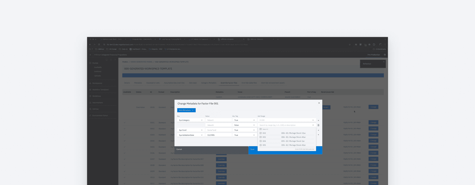
Milliman Integrate
Research Objectives
To kick off my first two weeks, I went on a "listening tour" to understand the research needs of the Integrate team, talking to 20+ stakeholders across the business.
I met with 20+ stakeholders across Product and Tech teams, including engineers, product leaders, voice-of-the-customer players, consultants, and even the CEO of the practice. Across these stakeholders, I asked these two main questions -
What are your top-of-mind research requests?
This helped me walk away with a list of research requests to prioritize based on impact and effort.
Where do you see potential for UXR at Milliman?
This allowed me to identify key opportunities and narrow in on areas where UXR can make impact.
🤔 A Writer's Note
In addition to key stakeholders, I strategically reached out to those I identified as "UX Allies". I found it important to understand their POVs on opportunities and blockers for UXR at Milliman. I identified these allies as…
A) People who took part in hiring me and advocating for this role
B) Those who took on customer-facing tasks (ex: Voice-of-the-Customer, Customer Success)
C) Those in UX-adjacent roles (ex: Front-end Engineer, UX Designer)
D) Forward-thinking Product Execs/Leaders
After gathering a list of research requests, I led a prioritization workshop so I could settle on a 4-5 research requests to tackle over the next 10 weeks.
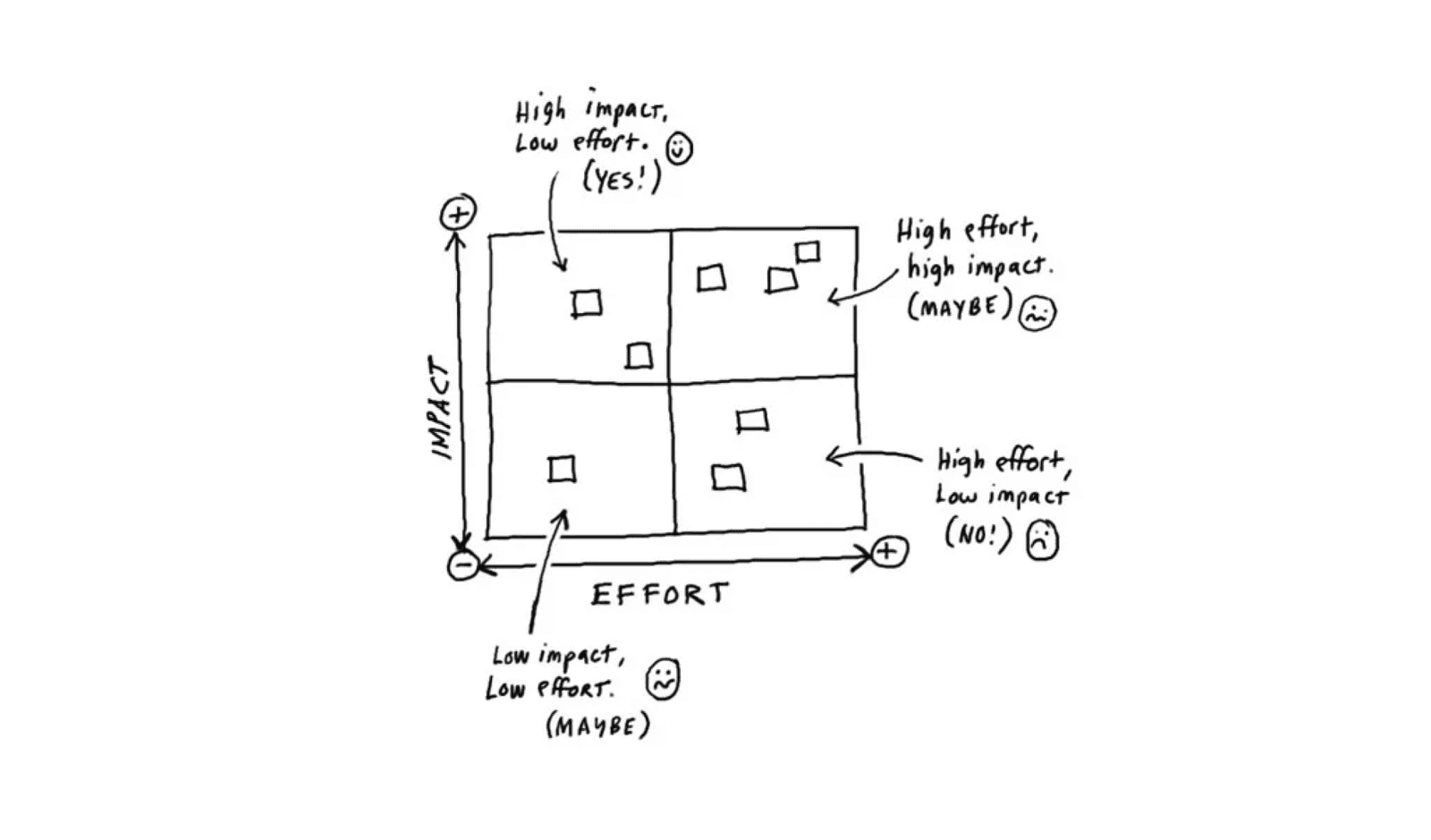
I led a workshop with my manager (Product Designer) and mentor (Voice-of-the-Customer) going through every research request mapped on whether it would be impactful to the business and feasible to accomplish. We eventually settled on a few research projects to further investigate within the "quick-wins" section (high impact low effort).
Research requests were sorted on an impact/effort matrix
Project Deep Dive — Unpacking Terminology Complexity Behind Bulk-Edit Actions
Business Challenge
Integrate was built solely by engineers for actuaries, resulting in overly technical, engineering-focused terminology that leaves actuaries struggling with unnecessary complexity.
A key action actuaries frequently perform in Integrate are "bulk-edit actions", where they edit hundreds of projections with just a few clicks. One of the first research studies I conducted at Milliman was a study unpacking 10+ pain points within the "bulk-edit" action workflow. A major finding revealed that challenges with these key actions extended beyond surface-level usability issues into more foundational problems—specifically around confusing and overly technical terminology.
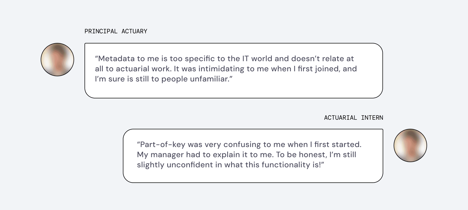
Within bulk-edit actions, terms like "metadata" and "part of key" embedded into this action are overly technical and require significant effort for users to understand — making what should be a simple action into a confusing one, where they're trying to guess whether the steps they're taking really aligns with their intended goal. Frustrating, right?
This finding aligned with initial hypotheses from product owners, who suspected the same — and now with concrete evidence from users as validation, they asked me to kick off a follow-up focused study into addressing these terminology issues.
Here's what some actuaries said in that first research study I completed
Narrowing the Scope
Thus, with stakeholder input, I formulated some research questions to unpack.
Research Goal
Gain clarity on proposed terminology to recommend as a change, in order to reduce complexity in "bulk-edit" actions.
Research Question #1
How do users' mental models of the "bulk-edit" workflow differ from the system's terminology?How does this disconnect lead to confusion and errors?
Research Question #2
Where and why are there areas of confusion with key terms, especially on "metadata", "part-of-key", and drop-down selections?
Research Question #3
Which terminology options best resonate with users in terms of clarity, simplicity, and intuitiveness for it's intended purpose?
During this phase, I also needed to gather all the potential terminology options to test with users. For each term that needed an overhaul, I consolidated a list of potential alternatives by consulting product owners, engineers, and other internal stakeholders who had insights into the system's functionality and user needs.
Research Methods
I conducted a week of 45-min 1:1 interviews with 10 internal actuaries at Milliman, utilizing an interactive co-design activity to unpack terminology perceptions and recommendations.
Pre-study: Recruitment
I recruited 10 internal actuaries at Milliman, as I was unable to access users at client companies (customers) due to restrictions in this time frame. These actuaries ranged in experience level and familiarity of Integrate, as well as in number of years at Milliman.
Co-Design/Build-your-own Activity
Due to the amount of terms to evaluate, I designed a fun co-design activity. I came up with this idea based on a similar method I used during an internship at HBO Max, where it was great at engaging participants and answering similar research questions!
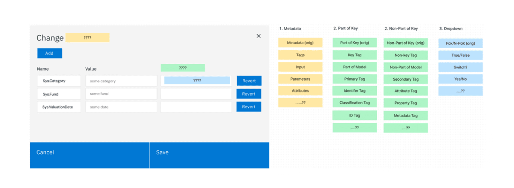
Activity Setup: Instead of giving participants binary term options (which would limit scope of discussion), participants were directed to a stripped canvas and given an array of terminology options of terms to overhaul.
Choice Selection: While going through terms in each column, participants answered the following questions:
“Out of this list, what are your top terms and why?”
“How does your selected term compare with the original term [if non-original term is selected]?”
“Do you find the term more or less relevant to describe [functionality] compared to the original term?”
“If you could add any other term to this list, what would it be and why?”
Participants were presented with this board and dragged-and-dropped selected terms
Insights & Impacts
This study provided initial insights into proposed terminology changes, including overturning initial hypotheses about which terms would be most effective.
By creating two distinct prototypes to test with users based from all the individual part design variations, we were able to evaluate how different design choices impacted discoverability and understandability.
🤔 Sample Insight
Being shown an image of the recommender in the component increases trust in the authenticity of a recommendation, resulting in an increased value proposition.
Design variations of the feature component with an image of the recommender were received more positively than those without. Having an image of the recommender allows the recommendation feel more personal, and authentic, reinforcing the purpose of the Recommended by Humans as a human-powered recommendation system.
“The picture makes it feel a little bit more personal, whereas without the picture, it's more like the platform is recommending it. I know it says it's by humans, but I still feel like it’s the computer recommending it whereas with a picture of Evelyn [the recommender], it's a little bit more real.” — Participant
💥 Research Impact
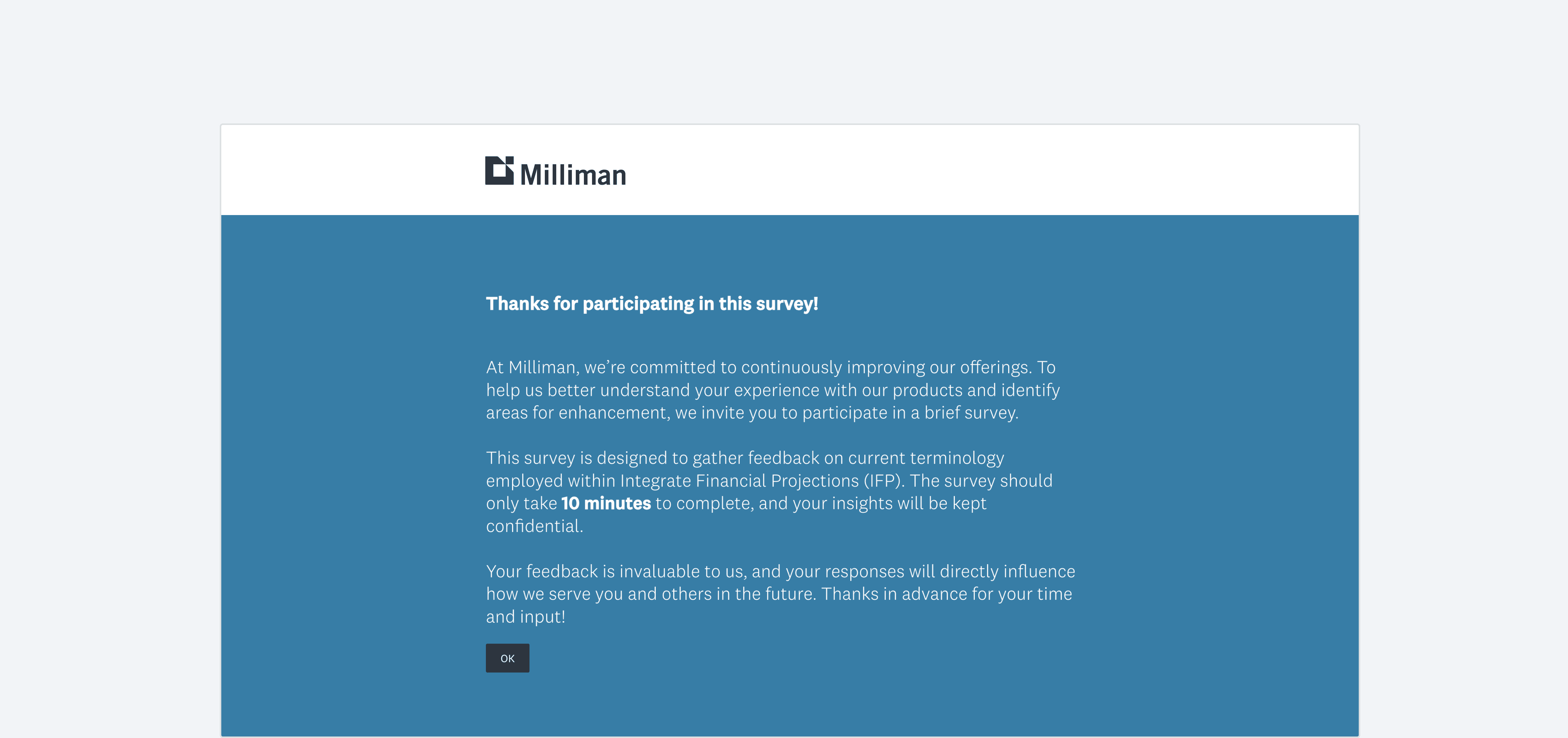
As a next step to further validate these initial findings, I designed a survey to collect feedback from client users on the proposed terminology changes.
This survey was distributed by my Product Owner partners to external users at client organizations after my departure. Before enacting such a large change, we needed to ensuring the findings could be validated based on real-world client input.
Client-facing follow-up survey
Additional Work
Leading 4 Workshops to Evangelize UX Research to 100+ People
Of course, I also had to share the good news of UX Research given that this was new to many! I led 4 workshops attended by over 100 people from diverse roles, including engineers, product leaders, actuaries, and designers. Topics ranged from introducing the purpose of UX Research to easy methods or tools to conduct research quickly. All in all, the purpose of these workshops was to...
🏣 Remind teams to think customer-first
Encourage teams to consistently prioritize intuitive user experiences during product development
🏣 Educate people on how to do research
Enable and encourage people to do self-serve and scrappy customer research on their own
🤔 Convince the business to invest in UXR
Show the short and long term impact of UXR as well as the need for dedicated research resources
💥 Bridge the gap between builders and users
Encourage product teams to loop internal users for feedback, bridging the gap between eng <> actuaries
One of many research workshops!
💥 Research Impact
Designers were equipped with basic methods and tools for conducting their own "scrappy" research.
End-users (Actuaries) were introduced to mechanisms for giving feedback.
Product owners and engineers were encouraged to shift their thinking toward prioritizing user needs!
Learnings
This was my first time being a solo UX Researcher. Since this would be the last internship I would (hopefully) ever have, I wanted to spend it doing something challenging and new!
Solo UX Researchers juggle many hats, but prioritization can be a remedy.
One of the most difficult parts of my summer was knowing how to spend my time wisely in a way that would be most beneficial for myself and the business. Balancing stakeholder expectations, short-term deadlines, and the broader research roadmap required constant negotiation and reflection, made possible through thoughtful prioritization of research tasks.
A way to gather momentum and buy-in is to show immediate impact.
Ultimately, I wanted to prove the value of UXR to stakeholders. Thus, to do so, I favored quick research wins that had an immediate impact. These fast insights helped me build trust with stakeholders by demonstrating how research could solve immediate pain points and inform better decision-making, proved over and over again over 12 weeks.
Many Thanks
I'm grateful to those who provided advice during (and before) my time there.
In the weeks leading up to my internship, I met with a few UX Researcher mentors to learn how to strategically tackle being a founding and solo UXR, given that it would be my first time doing so. I learned so much from Susan Lynch, Steve Fadden, and many more — I'm thankful they took the time to give thoughtful advice!
Thanks to Tanya Stockland and the wider Life Technology Solutions team at Milliman for giving me the room to experiment, lead, and stretch my scope in ways I haven't before. It was awesome to have a seat at the table, all thanks to them. :)
